 In summation of this VOFO project, this post will briefly discuss how and why collaboration with new technologies, online media and in particular this blog has really added a lot to my research and overall understanding of the voter information topic. Read the rest of this entry »
Posts Tagged ‘TED’
Wrap-up: How this VOFO project has aided my collaboration and research.
In Examples of Good VOFO, Research on November 16, 2012 at 9:23 amThe Smart Spider- “Where content and visualization come together”
In Examples of Good VOFO on April 27, 2012 at 3:37 pm
Design Niko Elsen, Concept Michael Herrmann.
An excellent example of visualisation in Political opinion mapping is the Sotomo Research Project (in German) lead by Michael Hermann from Zurich University. They were asked by the European Union to create a way for voters in European Parliamentary elections to more easily understand the where both political parties and individual candidates stood on the broad political topics. Hermann’s “SmartSpider” has gathered a significant amount of interest as “the next best thing” in Visualizing Politics and spectrums. Read the rest of this entry »
Political Information Can be Beautiful
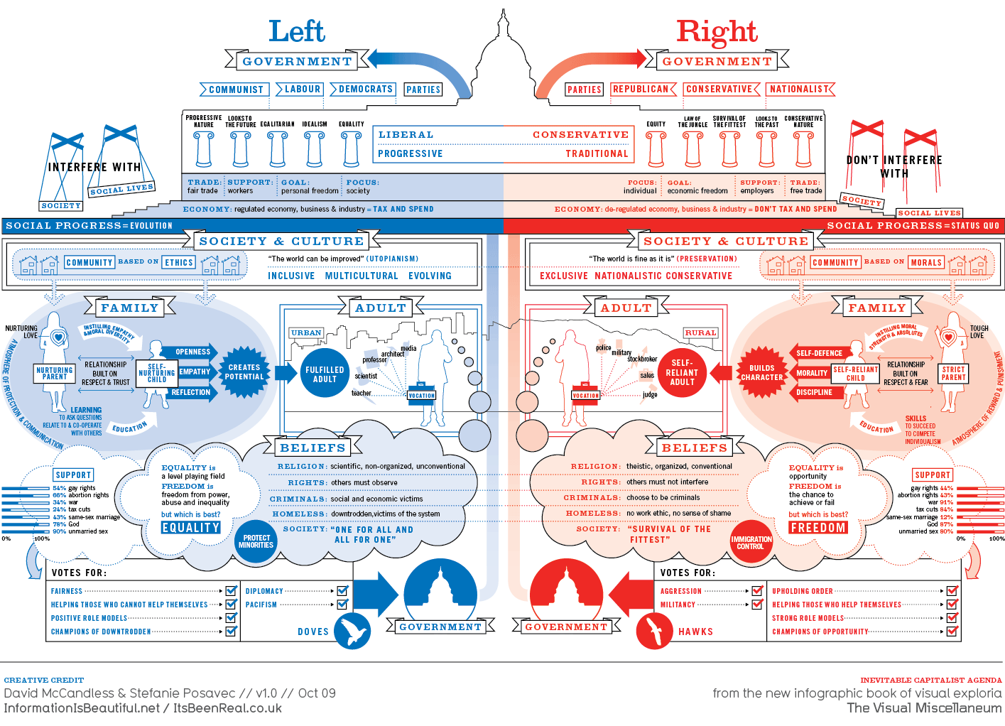
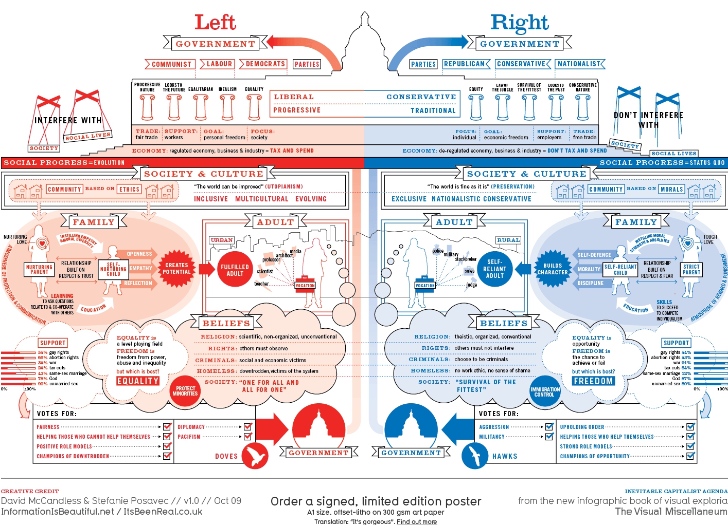
In Examples of Good VOFO on April 5, 2012 at 2:49 pmArticulating how the VOFO problem is a Design Problem is effortlessly captured by David MacCandless in this now infamous TED talk in 2010.
His comments in the last couple of minutes surrounding this particular info-graphic and how visual explanations literally “pour explanation” onto a reader is exactly the kind of user experience with information this blog will be exploring.

A real practical problem with color and politics however is almost self evident in the fact that this “non-US alternative” was also produced.
Read the rest of this entry »
